react-blessed
A React custom renderer for the blessed library.
This renderer should currently be considered as experimental, is subject to change and will only work with the React's latest version (0.14.x).
Summary
Installation
You can install react-blessed through npm:
npm install react@0.14.0 blessed
npm install react-blessed
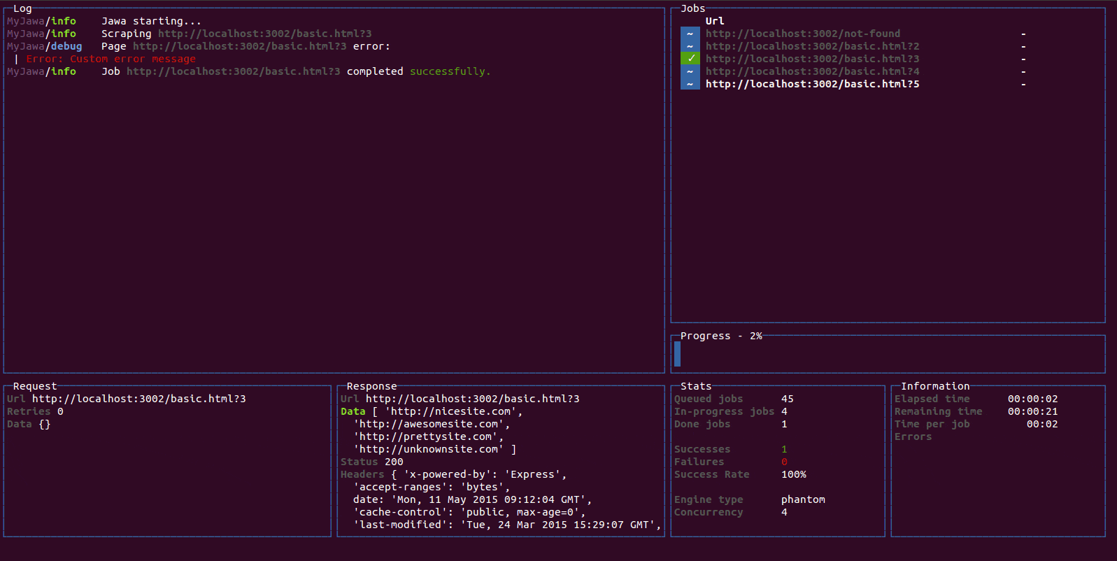
Demo
For a quick demo of what you could achieve with such a renderer you can clone this repository and check some of the examples:
git clone https://github.com/Yomguithereal/react-blessed
cd react-blessed
npm install
npm run demo
npm run dashboard
npm run animation
You may also check out react-blessed-hot-motion for a demo that uses React Motion for animation, and Webpack with React Transform Babel plugin for live editing.
Usage
Rendering a basic application
import React, {Component} from 'react';
import blessed from 'blessed';
import {render} from 'react-blessed';
class App extends Component {
render() {
return (
<box top="center"
left="center"
width="50%"
height="50%"
border={{type: 'line'}}
style={{border: {fg: 'blue'}}}>
Hello World!
</box>
);
}
}
const screen = blessed.screen({
autoPadding: true,
smartCSR: true,
title: 'react-blessed hello world'
});
screen.key(['escape', 'q', 'C-c'], function(ch, key) {
return process.exit(0);
});
const component = render(<App />, screen);
Nodes & text nodes
Any of the blessed widgets can be renderered through react-blessed by using a lowercased tag title.
Text nodes, on the other hand, will be rendered by applying the setContent method with the given text on the parent node.
Refs
As with React's DOM renderer, react-blessed lets you handle the original blessed nodes, if you ever need them, through refs.
class CustomList extends Component {
componentDidMount() {
this.refs.first.focus();
}
render() {
return (
<element>
<box ref="first">
First box.
</box>
<box ref="second">
Second box.
</box>
</element>
);
}
}
Events
Any blessed node event can be caught through a on-prefixed listener:
class Completion extends Component {
constructor(props) {
super(props);
this.state = {progress: 0, color: 'blue'};
const interval = setInterval(() => {
if (this.state.progress >= 100)
return clearInterval(interval);
this.setState({progress: this.state.progress + 1});
}, 50);
}
render() {
const {progress} = this.state,
label = `Progress - ${progress}%`;
return <progressbar label={label}
onComplete={() => this.setState({color: 'green'})}
filled={progress}
style={{bar: {bg: this.state.color}}} />;
}
}
Classes
For convenience, react-blessed lets you handle classes looking like what react-native proposes.
Just pass object or an array of objects as the class of your components likewise:
const stylesheet = {
bordered: {
border: {
type: 'line'
},
style: {
border: {
fg: 'blue'
}
}
}
};
class App extends Component {
render() {
return (
<element>
<box class={stylesheet.bordered}>
First box.
</box>
<box class={stylesheet.bordered}>
Second box.
</box>
</element>
);
}
}
You can of course combine classes (note that the given array of classes will be compacted):
const stylesheet = {
bordered: {
border: {
type: 'line'
},
style: {
border: {
fg: 'blue'
}
}
},
magentaBackground: {
style: {
bg: 'magenta'
}
}
};
class App extends Component {
render() {
const backgroundForSecondBox = this.props.backgroundForSecondBox;
return (
<element>
<box class={[stylesheet.bordered, stylesheet.magentaBackground]}>
First box.
</box>
<box class={[
stylesheet.bordered,
backgroundForSecondBox && stylesheet.magentaBackground
]}>
Second box.
</box>
</element>
);
}
}
Roadmap
- Full support (meaning every tags and options should be handled by the renderer).
react-blessed-contrib to add some sugar over the blessed-contrib library (probably through full-fledged components).
Contribution
Contributions are obviously welcome.
Be sure to add unit tests if relevant and pass them all before submitting your pull request.
git clone git@github.com:Yomguithereal/react-blessed.git
cd react-blessed
npm install
npm test
License
MIT